Guardian and Observer launch new Tabloid format
Some of you may have noticed that yesterday The Guardian launched in a tabloid format as well as unveiling a new look for its digital editions. On top of this, the Observer will also launch as a tabloid on Sunday 21 January.
Why have they done this?
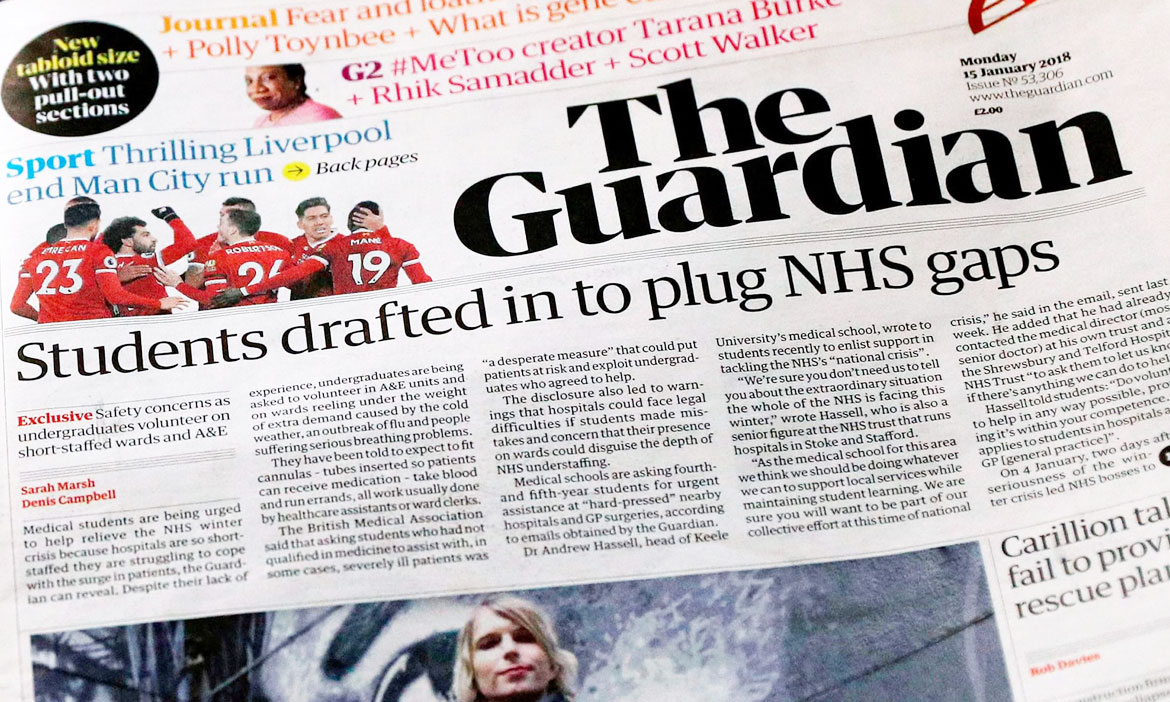
The inaugural print run of the new tabloid coincides with a redesign of The Guardian’s award-winning website and digital products for its 150 million monthly unique browsers around the world. The main reason, however, the primary contributing factor is cost saving, with the switch to a tabloid format expecting to generate savings in the millions of pounds and provide a size that’s easier for the users to read on the go.
Despite the smaller format, the main text font remains the same with marginal changes to size, line spacing and overall typesetting in a bid to improve readability. Some additional editorial and design innovations and improvements have also been introduced including a new daily pullout section of opinion and ideas and the addition of a brand new 24-page food magazine. In honesty, we can’t wait to have a read.
What else is new?
Most notably, the redesign features a new font and logo designed by New York- and London-based studio Commercial Type, which also created the original Guardian Egyptian font. The new font is called Guardian Headline and is a clear testament to the new formats, on both the print and web platforms.
“We have thought carefully about how our use of typography, colour and images can support and enhance Guardian journalism. We have introduced a font called Guardian Headline that is simple, confident and impactful.” – Katharine Viner
Ultimately this has been a radical shift for the users with the new format also being accompanied by the new site redesign and a refresh of the guardian apps.
“Guardian journalism itself will remain what it has always been: thoughtful, progressive, fiercely independent and challenging; and also witty, stylish and fun.” – Katharine Viner
Here’s hoping that design thinking helps to solve continuing issues publishers face when competing with digital formats and increasing overheads. Solutions like these as simple as they may sound are undoubtedly bold and innovative. We can’t wait to keep an eye on how things progress and are hopeful we’ll still see some great broadsheets out their in the wild.
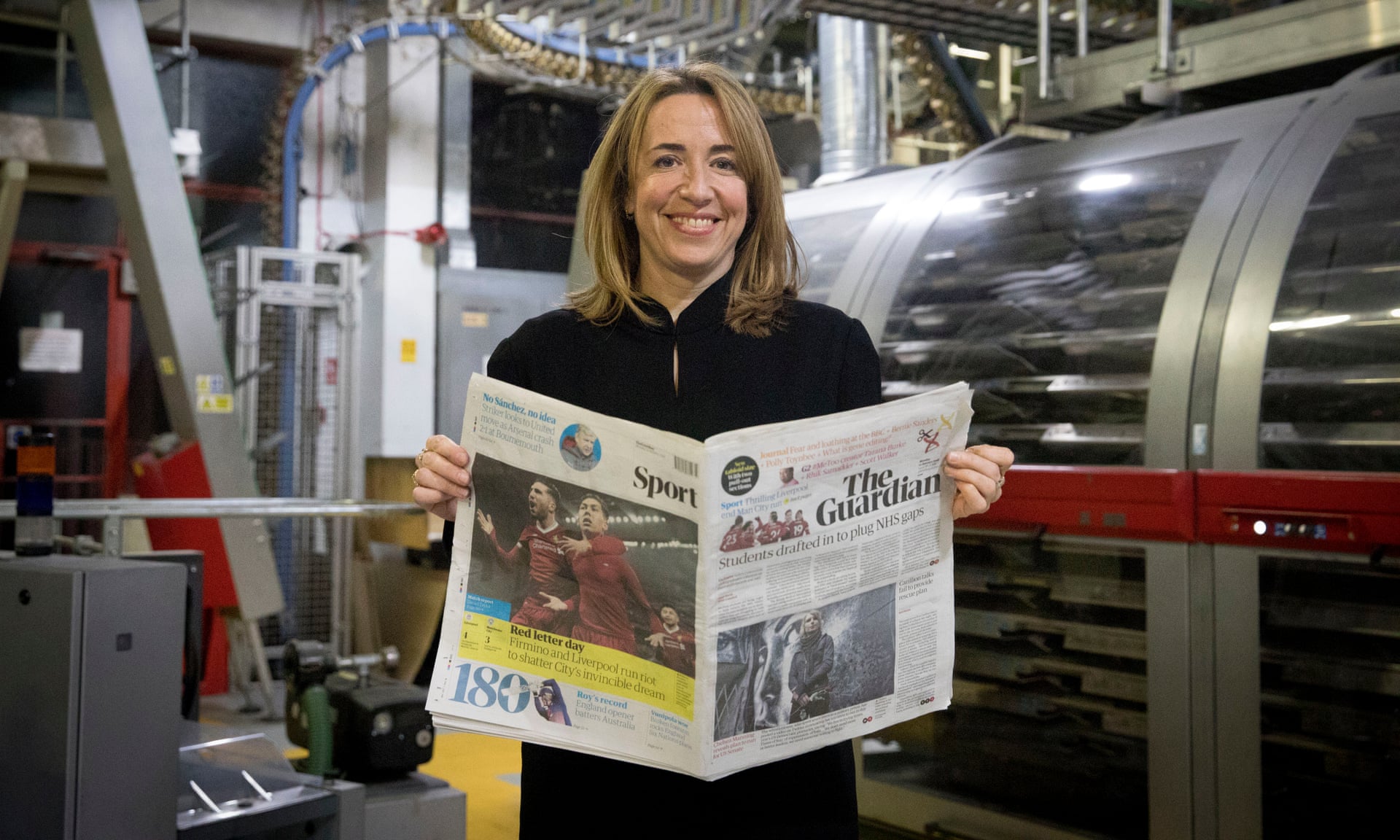
Photograph: Alicia Canter for the Guardian
Feeling inspired?
The good news is you don’t need to plan for a shift in the format that has taken seven months to come to fruition, so why not get started straight away and make the most of our 15% off January offer using the voucher code “JanuaryPoP” at the checkout.
Get started, upload your design now

